

Digital cameras today can give you very sharp clear images like the paintings of Jan Van Eyck. Of course you can use fast lenses to soften focus and give you some bokeh, but sometimes Claude Monet and his style of soft images might be a better choice.
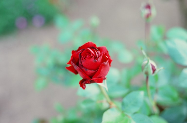
Both the top photo and the above rose are similar subjects but the look is entirely different. In my opinion it is easier to get the softer image of Monet using older lenses and film.

Which of these photos do you like best. I like them both. The Sony did an excellent job of balancing exposure and white balance and the film shot is the best one I have been able to get of this miniature Christmas tree with a lighted Christmas tree in the background. I think in the case of these two shots the tools used were needed for this result. I think to get the top shot with the Olympus camera you would need Portra 400 and the camera on a tripod. Plus you would need a flash with a cap over it to diffuse the light, which I don’t have. The Olympus does have TTL flash so that would be similar to the Sony. The Oly does not have steady shot so to get this shot hand held might be hard.
I tried getting the bottom film photo with several digital cameras. I was not able to get anything this good with the newer stuff. My point here is that to get good photos you need a variety of tools and you need to keep shooting. Keep trying and you will get some results you like. I am not telling you to spray and pray. What I am saying is to set up photos often and you will get some results you like.
Black and white adds a layer of mystery to draw you in.
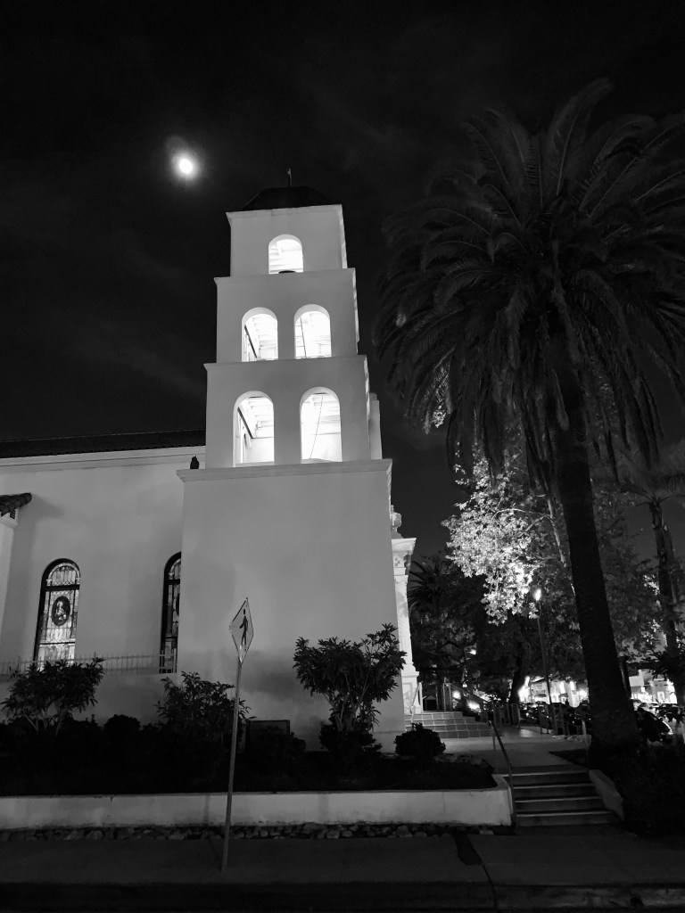
Both of these shot with iPhone XS Max. 
Do you like the black and white or color best? Of these two I prefer the black and white because it removes us more from reality than the color. The color shot is more like a Xerox of the scene. I like the black and white pulling us closer to the photo to see if the white spot is the moon or just a light. And the black and white adds a bit of sidewalk and street to pull us in. But I prefer color on the stained glass window. And I like color on the yellow street sign. Would these two pictures have been better with film. No doubt in my mind that both the color and black and white would have been better with film. Film adds a layer of distance between you and the objects. There is the analog chemical film process to make the image, and then the film image is scanned to make it a digital of the film. What is very nice is that the scanning is a Xerox of the image the film created. So all of what the film renders of the scene comes out in the scan. Using film and then doing a high quality scan is a great combination that adds the film’s rendering and then when you digitize it you can do some editing digitally instead of working in a darkroom. The best of both Worlds.
If you want clear clean sharp renders of the scene then digital is the best way to do it. But on the other hand if you want to create an impressionist version of the scene I suggest film and then scanning. Old lenses also help to give the impressionist look. Plus throw in some black and white. Every time I shoot a roll of black and white I always think that I should shoot some more black and white. I generally do not get that same feeling when shooting black and white digitally.
